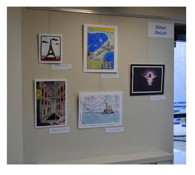
My collection of works focused on the theme of “home”. This took on a variety of meanings, from the literal depiction of my hometown to artworks that focused on the feeling of being safe and sheltered as one would at home. As a highschool senior, home has recently taken on a new meaning for me. In a matter of months, I will be living in a new space, in a new city, or possibly country, surrounded by virtual strangers. My first artworks reflected a younger, simpler concept of home, my town, my favorite places to go out. But as I moved away from my childhood home a year ago, and began to realize that everything I had associated with the feeling of home was disappearing in my life, I refocused on what constants in my life continued to stimulate that sensation. The cozy indoors, shelter from big rainstorms, moonlight on the water, these situations could exist in many places, yet all made me feel safe and at home in new environments. My Five Senses: Warm and Cold project presented a cozy room looking out at a stormy, old fashioned street. The setting, including the room, was unfamiliar to me, complete fiction, yet the sensations it inspired, warmth from bright street lamps, a cup of coffee, a comfortable chair, would make me feel at home anywhere. In Calm in the Storm, I display an island-city in the midst of a storm. The shelter depicted represents a shelter provided by the home environment from life’s problems. For the unstable clouds and ocean, I used the lighter medium of watercolor, which does not have strong value, while for the island, I used a colored pencil to create a solid color. Another way I explored home was through its opposite: travel. I love to visit new places all over the world, and while adventures abroad take me far from my community, I always keep a home base in mind. In my Eiffel Tower piece, which not only explored a new location but also a new type of media, I focused on the similarities between my home and other places. I arranged my artworks to balance the various themes and art elements in my artwork. Color, value, subject matter, and media, as well as the order of creation, are balanced between top and bottom, left and right. This effective balance is intended to represent the grounded, stable nature of “home”.